
Sunday, December 19, 2010
Graduation 2010
Here are the 2010 MAs doing the hat thing. It was great seeing them back for graduation, and to hear that most have jobs.

In the Simplification Centre we've also spent the last two years piloting a Certificate of Higher Education in Information Design, and the first four students graduated this month. Here are two of them, Preneeta Mann and Anita Nair, with Jenny Waller (who developed the programme) and myself (first time I've worn the academic dressing gown).


In the Simplification Centre we've also spent the last two years piloting a Certificate of Higher Education in Information Design, and the first four students graduated this month. Here are two of them, Preneeta Mann and Anita Nair, with Jenny Waller (who developed the programme) and myself (first time I've worn the academic dressing gown).

Thursday, December 16, 2010
60s coffee bar - in more ways than one
Passing this coffee bar in Liskeard, Cornwall, I couldn't help noticing not only that it was called the 60s coffee bar (think nostalgia, Merseybeat, Mary Quant,), but that most of the customers appeared to be in their 60s.And drinking coffee, obviously.


A personalised user guide
My mother is above the average age for mobile phone users, and has just got one for emergencies. A kind carer or possibly grandson has written out these personalised instructions. From the amendments it looks like they've been user-tested.


Affordances: the evidence mounts
Spotted in Milton Keynes shopping centre, another item for the affordances evidence file.
Is it the handle? Just take it off.
Or does it mean push, don't kick?

Is it the handle? Just take it off.
Or does it mean push, don't kick?

George III Ill
In the debate about seriffed versus sans serif type, we often mention the confusion between similar characters in sans serif typefaces: the lower case l, the number 1 and the capital I. Which explains why this line from the 1980s Radio 4 show Radio Active works (based on a spoof incompetent local radio station)
"She's seriously one hundred and eleven. (Pause). She's seriously ill."
"She's seriously one hundred and eleven. (Pause). She's seriously ill."
Rounded corner boxes - I forgive you
When desk-top publishing first came in (remember that term?) it was easy to draw boxes with rounded corners, something that had previously been very difficult to achieve with Rotring pens, CS10 board and french curves (ask a designer over 40 to translate).
Because they were so hard to do, they weren't in the professionals' repertoire, and therefore a sign of an amateur at work.
In this guide to design for DTP commissioned by Monotype in 1991, rounded corner boxes are a feature of this amateur-hour how-not-to example.

I've changed my mind now, although I'm still not keen on long line lengths, floaty headings in upper case, and needless naff shadows.
It was a dark and stormy night
My last post ended with a quotation from Lord Lytton. Like me, you're probably thinking 'who he?'.
Dictionaries of quotations often drop in names, assuming you know who they are. Now, of course, we have Wikipedia, and can find out in seconds (although don't tell my university colleagues who affect not to use it, at least when students are around).
If you're interested you could look him up yourself (he was a Victorian novelist and politician). But I thought I'd share one thing I learned there.
"Bulwer-Lytton's name lives on in the annual Bulwer-Lytton Fiction Contest in which contestants think-up terrible openings for imaginary novels, inspired by the first seven words of his novel Paul_Clifford:
'It was a dark and stormy night'".
From Heap to Skeleton
Going through some of my late father's books, I found a slim textbook, 'On the writing of English' by George Townsend Warner. It is undated, but published by Blackie & Son after his death in 1916. He was a renowned history teacher at Harrow School, and was the father of Sylvia Townsend Warner, the novelist.
It's a masterpiece of simple explanation - aimed at schoolchildren, it explains how to organise your ideas and write good essays.
His technique is to start by writing down all your thoughts: 'write them all down just as they come'.
This is your Heap, which you have to sort into categories that become a Skeleton. Today we might suggest a brainstorming, followed by a card sort to develop your organising principles, and then your outline.
For abstract concepts he proposes another familiar technique: 'Try this. Say to yourself: What? Where? When? How? Why? and take a piece of paper.' I wonder if he was the first to come up with this formulation.
And he demonstrates how this works for three different essay topics. Looks like a template to me.
He moves on to talk engagingly about style, and rhetoric. His own style has something of a Mr Chips twinkle in its eye. His 'two great merits' are:
'1. To have something to say.
2. To say it neatly.'
And a word for academics: 'Another product of the cowardly mind is the desire to qualify'.
Which all reminds me of something I once found in a dictionary of quotations, ascribed to Lord Lytton:
'Do you want to get at new ideas? Read old books.
Do you want to get at old ideas? Read new books.'
Wednesday, December 01, 2010
Editors vs designers
Eye magazine's blog features this nice infographic that they in turn credit to Andrew Losowsky of Stack America.


Thursday, November 25, 2010
Proof-reading and diminishing returns
When I worked at the Open University many years ago I remember hearing of a statistics textbook that was published with numerous errors, throwing students into panic as sums did not work. When the second edition was published errors continued to be found, and also in the third. However, the canny boffins turned the situation to their advantage by showing that the diminishing number of errors still found in each edition followed a neat curve. They challenged students to use that data to calculate how many errors might be predicted to be still present in edition four, five and six.
I was reminded of this by a recent post on Paul Luna's blog which includes a nice non-apology for numerous errors by a seventeenth century printer (the point being that the book took so long to print that facts that had been true when a particular page was printed, were no longer true when the book actually went on sale).
I was reminded of this by a recent post on Paul Luna's blog which includes a nice non-apology for numerous errors by a seventeenth century printer (the point being that the book took so long to print that facts that had been true when a particular page was printed, were no longer true when the book actually went on sale).
Dirty Work or Daily Mail?
I've been reading Rob Hillier's interesting PhD thesis on typeface design for people with dyslexia. A dyslexic person himself, he kept a diary of misreadings that he made between 2002 and 2005. He doesn't say if this is the entire collection, or edited highlights. I reproduce it here in the deadpan manner known to readers of Harper's Magazine:
“Special Events” misread as “Special Effects” (5th August 2002)
“CLASS WAR” misread as “GLASS WAR” (7th August 2002)
“Amnesiac” misread as “Asthmatic” (11th August 2002)
“Village of Parkside” misread as “Village of Paradise” (16th August 2002)
“MAR” misread as “WAR” (18th August 2002)
“Boating” misread as “Botanic” (18th August 2002)
“Felt-tip pens” misread as “penis” (28th August 2002)
“deaf signers” misread as “deaf singers” (26th October 2002)
“Win an incredible boarding holiday” misread as “Win an incredible boring holiday” (5th November 2002)
“Emily Bearn” misread as “Emily Beam” (24th November 2002)
Scudamore bullish over TV rights” misread as “Scudamore bull shit over TV rights” (26th November 2002)
“Bug Buster” misread as “Bag Burster” (22nd January 2003)
“Fiat father dies” misread as “Flat father dies” (25th January 2003)
“The Liberty” misread as “The Library” (24th February 2003)
“Phil Spencer” misread as “Phil Spector” (25th February 2003)
“WILLARD BEOPPLE” misread as “WILLARD PEOPLE” (15th March 2003)
“SHADY LITES” misread as “LADY SHITES” (9th April 2003)
“Handy Andy” misread as “Hardy Andy” (18th June 2003)
“Catalonia bans children from bullfights” misread as “Cantona bans children from bullfights” (27th June 2003)
“Split trust mis-selling probe is extended” misread as “Split trust mis-spelling probe is extended” (18th July 2003)
“SUPPORTING ACTS” misread as “SPORTING ACTS” (18th August 2003)
“Norwich Bravery Awards” misread as “Norwich Brewery Awards” (26th August 2003)
“HERO OF THE NORTH” misread as “NERD OF THE NORTH” (3rd September 2003)
“Sasakawa” misread as “Swastika” (19th September 2003)
“FACULTIES” misread as “F.A. CUP TIES” (13th September 2003)
“Mobiles ‘make you senile’” misread as “Mobiles ‘make you smile’” (14th September 2003)
“genteel London” misread as “rented London” (7th October 2003)
“Friea” misread as “Frida” (11th February 2004)
“How fair do you consider the unit assessment?” misread as “How far do you consider the unit assessment?” (11th March 2004)
“Travelling Around” misread as “Travelling Abroad” (19th March 2004)
“Dirty Work” misread as “Daily Mail” (19th March 2004)
“cocaine” misread as “codine” (20th March 2004)
“Spring city breaks” misread as “Sporting City breaks” (22nd March 2004)
“BBC will wreck quality title” misread as “BBC will wreck quality of life” (29th March 2004)
“resentful” misread as “restful” (31st March 2004)
“green” misread as “queen” (2nd April 2004)
“READJUSTMENT” misread as “READ JUSTMENT” (16th June 2004)
“‘new sister product’” misread as “‘new sinister product’” (20th July 2004)
“Heath art auction” misread as “Health art auction” (9th August 2004)
“Finding Mick Jagger” misread as “Featuring Mick Jagger” (20th August 2004)
“the less elegant” misread as “the less legal” (15th September 2004)
“CLONEX ROOTING HORMONE” misread as “CLONEX ROTTING COMPOST” (29th September 2004)
“tipster” misread as “lipster” (10th January 2005)
“Pakistani” misread as “Parkinson” (5th March 2005)
“The Art of Learning” misread as “The Art of Lettering” (14th March 2005)
“soft” misread as “80 ft” (21st March 2005)
“During the war” misread as “Doing the War” (28th May 2005)
“Windsor Chase” misread as “Windsor Cheese” (31st May 2005)
“Beaulieu Jazz Festival” misread as “Blackpool Jazz Festival” (19th June 2005)
“Buckfast” misread as “Breakfast” (20th June 2005)
“patients” misread as “parents” (25th June 2005)
“Carluccio’s hampers” misread as “Cappuchino hamper” (26th June 2005)
“Macmillan Cancer charity” misread as “Manchester Cemetery” (12th July 2005)
“dormant” misread as “dormouse” (21st July 2005).
Thursday, November 11, 2010
Sans everything
I've been writing some notes on the choice between seriffed and sans serif type. Or should that be sanserif type, one colleague asked?
On checking a few dictionaries within two minutes radius of my desk, there are votes for both:
Sanserif
Oxford English Dictionary, 1933 (sans serif not given as an alternative)
Oxford English Dictionary, 1989 (sans serif given as alternative)
Chambers Twentieth Century Dictionary, 1952
Collins Online Scrabble Checker allows it
Sans serif
Pitman's Dictionary of Advertising & Printing, 1930
Longmans Dictionary of Contemporary English (online 2010)
Merriam-Webster (online 2010)
Seeking refuge in usage statistics, the British National Corpus has few mentions of either, with the vote tipped toward sans serif (14, with sanserif clocking up 8, but no mention of sans-serif). The Corpus of Contemporary American English has just 32 mentions of sans serif, with no mentions of sanserif, and 15 of sans-serif.
I'm concluding from this brief escape from my to-do list that: sanserif, sans serif and sans-serif are all valid usages; that sanserif is British, and not found in the USA.
The OED also has a variant 'surryph' which I take to be the New Zealand usage.
And finally, older readers will recall the famous Guardian supplement on the Republic of San Serriffe, published on 1 April 1977.
Monday, November 01, 2010
News just in: Quavers now one calory more

I know it's a stretch, but could we think it ironic that this supposedly low calory snack now carries a picture of the bingo ball traditionally known as 'two fat ladies'.
Not very politically correct, that term, as the Daily Mail (who else?) pointed out in one of their regular 'PC gone mad' stories last year.
"A council which has banned the bingo phrases ‘two fat ladies’ and ‘legs eleven’ in case players are offended and take legal action was criticised for being politically correct yesterday.Sudbury Town Council in Suffolk fears it could be sued by overweight players or women who find the terms sexist.It has advised bingo caller John Sayers, 75, to revert to using the number ‘88’ instead of ‘two fat ladies’ and 11 for ‘legs eleven’."
Affordances evidence file
Exhibit A: a toilet door in a government office.

Exhibit B: Can't help feeling there's a story behind this one.

Exhibit C: this Lufthansa check-in machine had two of us foxed for a while. The problem is that the Reservation Code is a list of numbers, but there are no number keys shown. It turned out that the number keys appear once you place the cursor in the right box. But we didn't get that far before bothering the airline helper.

Sunday, October 24, 2010
Olympic security
In case you thought I'd lost interest in inept security questions (see here, here and here) I've just registered on the London Olympics ticket website.
Braving the shameful logo that I still can't get used to, I'm confronted by this choice of security questions:

Unfortunately at the age of fifty something, 'best friend' isn't a concept I think about much. I don't have a favourite sportsperson or a favourite food for that matter... at least not one that I could reliably remember two years later.
And what about all those poor sods who put Wayne Rooney down as their favourite sportsperson? Is there a way to change your mind?
I hope this isn't the entire Olympic security effort. Anyone who puts Osama bin Laden down as their best friend just won't get a ticket. That should do it.
Cleanliness 2010

Once inside you were rewarded with this very thorough 12-stage model of the hand-washing process.
Clarity 2010
Went to Clarity 2010 in Lisbon the week before last. Very stimulating, and met up with a lot of old friends. Three things stood out for me.

- Plain language is happening in more and more countries, and is taken seriously enough for governments to take action. For example, the Portugese government used the conference to announce a new initiative, and while we there President Obama was signing the new Plain Writing Act in the USA.
- While much discussion of plain language hasn't changed in thirty years (short sentences, common words, active voice), there were frequent mentions of information design, and several sessions looked at visualisations that clarify contract law.
- Many of the meetings were visualised by Susanne Hoogwater of Legal Sketchpad - she is one of a growing number of people who make a living from recording meetings using visualisation. She introduced me to a new book, Visual Meetings by David Sibbet. Worth a look. And there is an interesting link on her website to the use of visualisation in conflict negotiations: http://peacemapping.com/. The physical mapping of different views makes it less easy to ignore what the other side is saying, and reassures participants that their view has been recorded. Not that any fights broke out among the speakers.

Wednesday, October 20, 2010
You have been warned
This summer one of our students chose the Highway Code as her dissertation topic. It has evolved since its introduction in the early thirties, but is recognisably the same publication. This reminded me of a book we had in our house as we were growing up. A take-off of the Highway Code, You have been warned: a complete guide to the road was in print from 1935 well into the 1950s. It's by the cartoonist Fougasse and the writer Donald McCullough and I still enjoy it. Here are some favourite pages.


Monday, October 18, 2010

Sunday, October 10, 2010
Dona Wong on information graphics
Dona Wong's Wall Street Journal guide to information graphics is a great desktop guide to the design of graphs, charts and tables. She goes through all the basics, and demonstrates them using a simple graphic syntax that is undistracted by cool examples or the work of famous designers. Once you get used to her at-first-cryptic way of distinguishing bad practice (down arrow) from good (up arrow), it works brilliantly. This wasn't planned as a full review, but to note her thoroughgoing approach to information design and simplification. I loved her diagrammatic acknowledgement of the people who helped.
 Dona Wong (2010) The Wall Street Journal guide to information graphics: the dos and don'ts of presenting data, facts and figures. New York/London: Norton & Co.

Friday, October 08, 2010
Clearing up crime
From a leaflet through our door on neighbourhood policing.
 I'm glad they cleared that up.

Plain Words in plain English
Sir Ernest Gowers is rightly acclaimed for his handbook on clear English, The Complete Plain Words. Published in 1948 it has never gone out of print.
 It was aimed at civil servants communicating with the public, and in the first edition he writes "The purpose of this book is to help officials in their use of written English. To some of them this may seem a work of supererogation, calculated only to place an unnecessary new burden on a body of people already overburdened."
That's right - supererogation. I had to look it up too (it means 'spending over and above, beyond the call of duty'). And I had take a couple of run-ups before being able to say it out loud (think super + erogation).
A civil servant in 1948 would no doubt know this word, and therefore Gowers's sense of audience was impeccable. But these days we would tend to write about plain English in plainer English.
So I've had a go at translating a key section of Plain Words into plain English:
The original reads:
"A new technique is being developed for those pamphlets and leaflets that are necessary to explain the law to the man in the street in such matters as P.A.Y.E. and National Insurance. Its guiding principles are to use the simplest language and avoid technical terms, to employ the second person freely, not to try to give all the details of the law relevant to the subject, but to be content with stating the essentials, to explain, if these are stated in the writer's words and not the words of the Act, that they are an approximation only, to tell the reader where he can find fuller information and further advice, and always to make sure that he knows what are his rights of appeal."Proof, perhaps, that a 92 word sentence can be reasonably easy to read if it is simply a list separated by commas. Here's my version:
"How to explain things like P.A.Y.E. and National Insurance :We haven't really improved on that advice in 60 years. To try would be supererogation, 'nuff said.
- Use simple language and avoid technical terms
- Use ‘you’ as much as you can
- Don’t try to give all the details, but just give the basics
- Say where people can find fuller information and further advice
- Always make sure people know their rights of appeal."


Saturday, October 02, 2010

Monday, September 13, 2010
Comic Sans or calligraphy?
My 95-year old Dad died recently and I had the task of designing the order of service for his funeral. Looking for a model to follow, I stumbled across several design-it-yourself websites. I enjoyed the sense of fun in the wide choice of colour options, and the choice of fonts, from the Cooperative Funeral Service.

I suspect Dad might well have gone for the Comic Sans or Arial, for its legibility.
Instead, I commissioned some calligraphy from Dublin calligrapher Gareth Colgan, an ex-Reading student. You can see more of his work on his website: http://www.garethcolgan.com

I suspect Dad might well have gone for the Comic Sans or Arial, for its legibility.
Instead, I commissioned some calligraphy from Dublin calligrapher Gareth Colgan, an ex-Reading student. You can see more of his work on his website: http://www.garethcolgan.com

Monday, August 23, 2010
Soft drinks only

You've guessed by now that the missing letter was in fact an 'r'.
Sunday, August 15, 2010
Singular pants

As this swing ticket says: 'This lightweight trekking pant is made from...'. But it goes on: '...so they work in any terrain'. Obviously still a work in progress, this transition.
Odd thing is, on the website it/they is/are called trousers.
Wednesday, July 28, 2010
Before and after: it had to happen

In this case I couldn't help noticing our T-Mobile bill design as the 'before' to the new design developed by Boag Associates and Tullo Marshall Warren, illustrated in Borries Schwesinger's The Form Book. While not wanting to take anything away from the new design, I thought it might be worth looking at why designs become obsolete and need revisiting.

A key constraint of this design was that it had to be implemented in the Flexible Bill Formatter application that is integral to the Amdocs billing platform. Amdocs dominates mobile phone billing and although at this time (the project started in 1998, I think) their formatter was very primitive compared with dedicated systems such as Doc 1, we had to use it... and were surprised to find that it could not cope with double column layouts. That's why in our design the customer information block is to the right and below the main billing information – Amdocs could not get it to sit in the white space above.

When T-Mobile acquired One2One they asked us to adapt the bill to the new brand, with the result below left. The new brand guidelines no longer allowed the tinted background that previously had highlighted the total on a white panel. But note that this is different in two key respects from the 'before' that appears in the case study (below right). In our version the customer information is anchored by the vertical line, that in the case study 'before' floats below it. And in our version, there is a prominent contact phone number at the top right, missing in the case study example (and criticised for being missing there).


The lesson from this – information design works in a shifting environment, where products change brands change, and most importantly people change. Memories fade, and designs aren't always maintained.
When we became fully integrated into Enterprise IG, following our own acquisition, we had to stop working for T-Mobile as Vodafone was a major client of the group. This was regrettable, as we had by then been asked to develop radical new designs for the bill, which, it was obvious to everyone, was no longer fit to cope with the new products and tariffs being offered by that time (2004). Here is one of the more exploratory designs we developed, never produced (designer: Richard Bland).

Borries Schwesinger's The Form Book

I've just been reviewing Borries Schwesinger's The Form Book for IDJ. I'm a fan. It's an engaging book that manages to combine a sense of the history and social role of forms, with a primer in basic typography, a genre analysis identifying the essential features of different kinds of form, and a portfolio section of interesting forms from information designers around the world - some more exemplary than others.
Formulare Gestalten, the original German edition has been out for a few years, and this new version, with a more international set of illustrations is set to sit alongside Robert Barnett's work as essential reading for forms designers.
My only criticism (apart from carping minor ones that would only draw attention away from Borries' achievement) is that it has come rather late in the day – just as paper forms are starting to seem rather irrelevant and unnecessarily complex when compared with their personalised, carefully-paced, take-it-easy digital cousins.

The Form Book is published by Thames & Hudson, 2010.
Thursday, July 15, 2010
Energy and apathy

Just noticed the battery's run out but no idea how long ago, and I don't think I'll bother replacing it. The truth is I stopped looking at it in about week three. Nothing changed very much, and few of the figures it displayed shocked us very much. Rather the opposite in fact. Running around the house turning off appliances on stand-by hardly dented the figure. And while putting the tumble dryer on was very noticeable, it was easy to conclude that we could afford the 90p per hour.
This makes me wonder about the millions being spent on the national rollout of smart meters. Most studies of their effectiveness report that few people are moved by them to reduce their energy consumption, and that for many people the economic motivation doesn't work that well. Having said that, whatever approach they end up taking to what is a huge behavioural change challenge, feedback will play some part - so there will be a function for these meters after all.
Thursday, May 27, 2010


Monday, May 17, 2010
Impressive
It is nice to see information design reaching new areas of life. The Clear Building Survey, offered by some building surveyors, looks much easier, both to write and to read, than the traditional kind.

Economic recovery - I'll drink to that
I'm impressed that the Scottish Parliament publishes information in three languages: English, Gaelic and Lorem Ipsum. And I love that the photo accompanying the headline 'Scottish Economic Recovery Plan' is a pint of beer. That's definitely a plan.
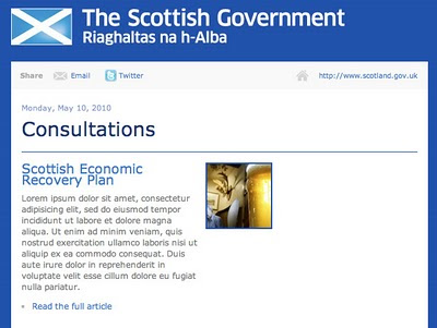
Thanks to Martin Evans for this.

Thanks to Martin Evans for this.
Sunday, May 16, 2010
Which? chart is the dodgier?
We've been discussing the concept of graphic literacy in our department. Part of it has to be the ability to spot errors, in the same way that you might spot a word used incorrectly, or poor grammar.
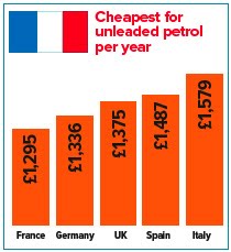
The Met Office chart was one example of poor graphic proof-reading, and here is another one. I saw this in Which? magazine last November and sent them a green-ink letter. It's from an article about the cost of living in the UK, compared to other European countries. The article actually showed that the UK was the second cheapest of the five countries they compared, but they chose to highlight the high cost of fuel in their headline.
In a geeky moment, I compared the figures they gave with the accompanying bar chart - the £39 difference between Germany and the UK results in twice the height difference as the £112 difference between the UK and Spain. And their chart does not appear to start at zero. Here's their graphic and one I knocked up by entering the figures in Excel.


Perhaps this is a bit geeky, but Which? claims to be unbiased and evidence-based. They said they'd check what had happened, but the offending graphics are still on their website.
The Met Office chart was one example of poor graphic proof-reading, and here is another one. I saw this in Which? magazine last November and sent them a green-ink letter. It's from an article about the cost of living in the UK, compared to other European countries. The article actually showed that the UK was the second cheapest of the five countries they compared, but they chose to highlight the high cost of fuel in their headline.
In a geeky moment, I compared the figures they gave with the accompanying bar chart - the £39 difference between Germany and the UK results in twice the height difference as the £112 difference between the UK and Spain. And their chart does not appear to start at zero. Here's their graphic and one I knocked up by entering the figures in Excel.

Perhaps this is a bit geeky, but Which? claims to be unbiased and evidence-based. They said they'd check what had happened, but the offending graphics are still on their website.
Probably a poor chart
UK people will remember that in 2009, one of the rainiest summers in memory (and the third rotten summer in a row), the Met Office issues an optimistic press release promising "The coming summer is 'odds on for a barbecue summer', according to long-range forecasts".
This was accompanied by this bar chart, brought to my attention by Emma Hicks, a student on our MA Information Design course. She is doing a project with our meteorology department to suggest improvements to the way they express probabilities in forecasts.

Not only does it display 20%, 30% and 50% in the wrong proportions, but the hotter orange colour for the 50% bar makes it appear that a much more extreme difference in temperature is being forecast. Actually the predicted differences are less then 1 degree apart.
As it happens, the summer was warmer than average... the only problem was it rained all the time.
The Met Office has since announced they are dropping long range forecasts. They might want to look at their PR department at the same time.
Sunday, May 09, 2010
In defence of Powerpoint
I recently became slightly embroiled in a debate about Powerpoint, when it came under fire [insert own pun about bullets] on the infodesign café list - best known critic is Edward Tufte, of course. Thought I might share my contribution here:
"In defence of Powerpoint, perhaps the contrarian view in this list...
- on one hand, there's nothing more deadly than someone reading off a load of bullet points, word for word
- but on the other hand something like this doesn't catch on unless it fills a need, and we should hesitate before assuming people are lazy or worse for using it
- it's not always displacing a longer reasoned argument (which takes hours to write). More often it's the alternative to a spontaneous, unscripted verbal performance, which goes unrecorded, can easily go wrong, and which not everyone is confident enough to attempt.
- I've found Powerpoint particularly useful when speaking to people whose first language is not my own, and for following presentations in another language, when I have only a school-level reading knowledge of it..
- it's also good for people who weren't at the meeting... when I've given presentations without slides, or with purely visual ones used as punctuation or as talking points, I end up producing bullet point versions to distribute later.
- is there some contradiction between the view that Powerpoint "fundamentally devalues reasoning and logic in an argument, and replaces it with mere summation and statement" and the idea that "one good image, or one good graph with important statistics, is much more persuasive"? [quote from another debater in the list]
- Powerpoint is easily mocked with the Gettysburg address or Churchill's speeches in bullet point form, but oratory uses similar techniques to make itself easily grasped and memorable: rhythm, alliteration, etc.
I think seven bullets is enough... "
Wednesday, May 05, 2010
Giant mosquitoes - you must be joking!
In the context of an academic network, someone recently recounted a well known anecdote about visual literacy in Africa - the one where farmers dismiss a film about controlling mosquitoes or locusts on the grounds they don't suffer from giant insects that are 4ft wide (the size they appeared on the screen - geddit?). I have heard this story too, and wondered if it was an urban myth (or rural myth, even).
A few moments' Googling produced the probable origin of the anecdote, and a different interpretation: that the African viewers were in fact joking, but were misinterpreted by colonialist observers predisposed to think them primitive and visually illiterate. James Burns, a historian of African culture traces it to a colonial film maker William Sellers.
William Sellers (1941) The production of films for primitive people, Overseas Education: A Journal of Educational Experiment and Research in Tropical and Sub-Tropical Areas, (October 1941), p. 221.
A few moments' Googling produced the probable origin of the anecdote, and a different interpretation: that the African viewers were in fact joking, but were misinterpreted by colonialist observers predisposed to think them primitive and visually illiterate. James Burns, a historian of African culture traces it to a colonial film maker William Sellers.
“After the war, when the magazine Colonial Development reported on the work of the Colonial Film Unit in Africa, it managed to squeeze two of Sellers’ stories into the article’s first paragraph.Burns goes on to suggest an alternative interpretation:
‘On one occasion, during the showing of a serious instructional film in Nigeria, the audience was unaccountably rocked with laughter. It was afterwards discovered that the behaviour of a white hen that had strolled into the picture had distracted attention from the main purpose of the film. A film on malaria being shown to a bush audience made little impact because at one point a greatly enlarged picture of a mosquito filled the screen so that its structure could be explained. The audience declared that there was no reason to fear the tiny mosquitoes they knew, which were quite different from the huge and terrifying creature they saw on the screen.’
George Pearson, who became the Colonial Office’s chief film maker in 1939, related the story in an article he published in 1949. ‘The reaction among the natives was ruinous to the film purpose, for they said there would be no need for them to worry about the little mosquitoes they knew; those in the film were enormous and terrible things quite different from anything in their country!’ Pearson then explained the obvious lesson: ‘What had been overlooked was the complete ignorance of the primitive mind and magnification’[24]. Pearson could not resist retelling it a decade later in his autobiography. The story lives on in Southern African today. The historian Tim Burke found it circulating among White professionals in the advertising industry in Zimbabwe in 1991.”
“One’s first impression is that these stories are apocryphal, particularly since the specifics of the incidents are rarely given. And if true they are certainly open to alternative interpretations. Megan Vaughan, in discussing the reaction of the audience to the mosquito on the screen, pointed out that Sellers and his successors never considered that such comments might have been meant ironically. My own experience in Zimbabwe suggests the likelihood of this possibility. Two separate former mobile cinema operators of the Rhodesian Information Service recounted to me their experiences showing rural people films explaining the lifecycle of a new strain of maize. The use of time-lapse photography inspired members of two separate audiences to ask ‘Why does our government not give us this maize which grows so fast?’ Both informants related this story as evidence of the credulity of their audiences. However, when I told a third retired cinema operator this story he merely laughed: ‘Did they not realise the people were only joking?’.”James Burns (2000) Watching Africans Watch Films: theories of spectatorship in British Colonial Africa, Historical Journal of Film, Radio and Television, 20: 2, 197 – 211
William Sellers (1941) The production of films for primitive people, Overseas Education: A Journal of Educational Experiment and Research in Tropical and Sub-Tropical Areas, (October 1941), p. 221.
Monday, May 03, 2010
Small print and your immortal soul
You may have read about the computer game company who inserted a new clause in their small print as an April Fools' Day jape. Around 7,500 customers apparently assented to terms and conditions that included the transfer of rights to their immortal soul to Gamestation.
On the basis that 12% of customers ticked an opt-out clause, Gamestation estimate that 88% of people fail read the small print before making online purchases. I'm surprised as many as 12% read them - I've asked this question at a number of conferences where I've spoken, and I reckon 2 out of about 400 people have put up their hand and admitted to reading the small print.
I found a nice comment about this on Mumsnet (in case you're wondering, no, I'm not a Mum - I googled it).
According to commenter GerbilMeasles, these are known as Friday Sandwich Clauses, and are sometimes inserted by playful solicitors to check if the other side is actually reading the contract they are supposed to be negotiating: 'They normally read something like "On completion and for a period of fifteen years from completion, the Vendor's solicitors shall on request from the Purchaser's solicitors provide on each Friday that is a Business Day a selection of sandwiches, pastries and other snacks as specified by the Purchaser's solicitors."'
Apparently a surprising number of these make it through to the final draft.
Saturday, April 24, 2010
Flying 101
Kulula is a low budget airline in South Africa with playfully painted planes. Information designers will like this one, called Flying 101 by the airline - David Farbey sent this link to the infodesign café a while back, and I thought I'd pass it on.


Simplifying Time
'The one great thing was simplification. Simplification by organization, simplification by condensation and also simplification by being damn well simple.'Henry Luce, founder of Time magazine, quoted in The New Yorker, 19 April 2010, page 81.
And from an early prospectus, quoted in the same article by Jill Lepore:
'TIME is interested – not in how much it includes between its covers – but in HOW MUCH IT GETS OFF ITS PAGES INTO THE MINDS OF ITS READERS.'
Thursday, April 22, 2010
Fading timelessness
I bring you a minor ink irony. Just noticed that my copy of Christopher Alexander's The Timeless Way of Building, which was bright yellow when I bought it last year, has now faded to white.


Wednesday, April 21, 2010
Extreme simplification: strip out everything they're going to forget
When I hung around in the world of branding, we used to talk a lot about essences - the main idea about a product or company. We sometimes used an exercise in workshops to tease out the essence of an idea - we asked people to sum up a concept or brand in less than ten words.
We'd start with some generic ones to get the conversation flowing:
Starbucks: OK coffee, comfy chairs
The Atkins Diet: Eat lots of meat, get thin
Credit card interest: Pay it all now, or pay more later
The off-side rule: don't hang around near the goal
Then we'd throw in some of their products to see if they could do the same thing.
BlackBerry
Pay as you talk price plans
This is a form of extreme simplification. I was reminded of it on a visit to Kew Gardens today. Kalani Seymour, who is Interpretation Manager (it means she helps visitors to interpret what they see), is setting an MA project, and showed us around her enviable workplace.
On Kew's treetop walkway, Kalani has written and commissioned design for a series of ultra-short explanations of how trees work. The way she put it was 'you strip out everything they're going to forget'.
Here's one of them. A kind of scientific haiku, I reckon.

Wheelie bin numbers: why so big?


Wheelie bins in Reading are often painted with enormous numbers. If you apply the ratio of size to viewing distance normally used for designing signage systems, I reckon these numbers are big enough to use on an airport runway, not a plastic bin that you're standing next to.
Big numbers are probably the result of people grabbing the best tool available for writing a number on a dark plastic bin - a pot of white gloss and a 2 inch brush left over from painting their house.
But our local garden centre now sells wheelie bin numbers in vinyl. Bizarrely, these are also enormous. I think we've witnessed the birth of a genre - to count as wheelie bin numbers, they have to be huge.
Subscribe to:
Posts (Atom)