
Tuesday, December 27, 2011
Proper handwriting
Tuesday, December 06, 2011
Odd Peugeot graphic

Friday, November 25, 2011

Saturday, November 12, 2011

Green and black

Hey, Shell, what are you thinking of? Green is the colour code for petrol, black for diesel. So it's not surprising that I nearly put diesel into my car instead of petrol.
It doesn't help that the green brand name is positive (dark on light) and the qualifying word 'diesel' is negative. It's hard to see both at once, as this older blog post demonstrates.
Compare and contrast
No prizes for guessing which of these notices is from Pizza Hut, which from an engineering company, and which from a university. Branded language is real!
'These toilets should be spotless (we check them all the time). If they're not, just let us know and we'll sort it.'
'All bathroom incidents should be reported to Facilities Management.'
'Would you kindly refrain from putting chewing gum in the urinals.'
'These toilets should be spotless (we check them all the time). If they're not, just let us know and we'll sort it.'
'All bathroom incidents should be reported to Facilities Management.'
'Would you kindly refrain from putting chewing gum in the urinals.'
Monday, November 07, 2011
Novelties, eh?
Forgeries are now sold as 'novelties' it seems. You can get a utility bill, driving licence, student card, or degree certificate tricked up with your name and address, and off you go. Of course they could be so bad, or obvious, that no one'll be fooled... but who'd pay £40 for that?

But would the designers of the newest BT bill please let them have up to date artwork with the right font: using the old one with a new date might just raise suspicions.

Are Western Union really sponsoring this?
I should add that this company do have commendably clear terms and conditions, that disclaim anything but 'novelty' uses. I do like their final statement and wish every firm did the same: "Custom-cards.me.uk have kept the T&C's simple and straight forward. This way we hope that everybody will understand them and abide by them."
Wednesday, November 02, 2011
Vs and Us

That apart, it's an interesting use of type size and underlining to score our reading aloud.
Wednesday, October 12, 2011
What we're all thinking?
A couple of refreshingly frank titles from blogs that just came up in a Google search. Haven't looked at them yet, but I don't really need to.
Stop Already With the F*cking "Infographics"
Enough with these so called ‘infographics,’ they’re nothing but chartcrap
Stop Already With the F*cking "Infographics"
Enough with these so called ‘infographics,’ they’re nothing but chartcrap
Monday, October 10, 2011
Early morning grid
The sky outside our window, a couple of mornings ago. You can tell these aren't Swissair planes, or they'd have drawn their grid straight.


Helpful sign

Accurate labelling can be so important – presumably when there's just one left, someone changes the sign to Apple. (The Russell Hotel, London).
Friday, October 07, 2011
My Mac Plus
Steve J's death has brought the old Mac Pluses out in a burst of affectionate nostalgia. Here's my contribution: when I finished my doctoral thesis, Jenny commissioned a portrait of my Mac from artist friend Diane McKeating. It is sitting on top of my enormous state-of-the-art 20 megabyte hard drive. Well, this was '87.


Thursday, October 06, 2011
Steve Jobs RIP
I ran experiments and analysed results on my Apple II (1980)
I wrote my thesis on my Mac Plus (1985)
I started my business with my Apple II (1988)
I run my life on my MacBook, iPhone, iPad (2011)
Extraordinary guy, who put it all together, made it happen, and made it fun.
I wrote my thesis on my Mac Plus (1985)
I started my business with my Apple II (1988)
I run my life on my MacBook, iPhone, iPad (2011)
Extraordinary guy, who put it all together, made it happen, and made it fun.
Tuesday, October 04, 2011
Cooincidence?
Last week I had a pop at the Co-operative Bank on this blog, because a form I downloaded to print off at home had a solid blue cover (using up a lot of blue toner). Going back there today, it's changed. Much better, thanks.


Coincidence? Or do they have some system that looks for online mentions so they can respond. If so, that's really responsive... co-operative, in fact.


Coincidence? Or do they have some system that looks for online mentions so they can respond. If so, that's really responsive... co-operative, in fact.
Monday, October 03, 2011
Brown signing
Not a book signing by Gordon, but a nice website celebrating those brown signs that point to tourist attractions (allegedly).
Fans of strangely specific icons (not just 'farm' but 'cider farm', not just 'horse' but 'heavy horse') will enjoy Angela Hone's blog.


Fans of strangely specific icons (not just 'farm' but 'cider farm', not just 'horse' but 'heavy horse') will enjoy Angela Hone's blog.


Sunday, October 02, 2011
For musicians

My sister encountered this and Facebooked it. I'm thinking we could usefully take this approach to all kinds of instructions. For example, installing any kind of Windows software or device: "Click on 'install'. Stay calm."
Or phoning your broadband helpline: "Phone 0845 123456. Watch your language."
Or phoning your broadband helpline: "Phone 0845 123456. Watch your language."
And so on.
Wednesday, September 28, 2011
If you're designing a form to print out at home
If you're designing a form for people to print out and send in, please make a note: don't use up all my blue ink.
I'm talking to you, Cooperative Bank.

I'm talking to you, Cooperative Bank.

Tuesday, September 27, 2011
DIY doom
This morning's brief distraction: make your own warning signs at www.warningsigngenerator.com


Now we just need a European version.
Sunday, September 25, 2011
Infographics as knowledge curation
It's noticeable that more and more people are describing themselves as 'curators' - a term one used to encounter only rarely as the job title of someone arranging neolithic arrow heads in a museum. Words only appear or change their meaning when enough people have a new meaning they want to express. Perhaps the new curation is a reaction to the fragmentation of the digital world - we feel the need to make sense of the chaos, the speed of change, and the sheer vastness of what's on offer. So each of us curates our Facebook page or blog, in an updated version of the mixer tape, or the coffee table display of novels, CDs and obscure fruit we artfully disarrange to impress and educate our guests.
I wonder if this doesn't also explain why infographics are so in vogue. We can abandon the dismal process of endless clicks through news stories that retrace their path, that are all based on the same primary source, or that leave us stranded as if we're at the top of the stairs trying to remember what we came up for. Someone has looked at the data, sorted out the arguments and presented them to us in a single compelling display: they've curated the issues.
I wonder if this doesn't also explain why infographics are so in vogue. We can abandon the dismal process of endless clicks through news stories that retrace their path, that are all based on the same primary source, or that leave us stranded as if we're at the top of the stairs trying to remember what we came up for. Someone has looked at the data, sorted out the arguments and presented them to us in a single compelling display: they've curated the issues.
Friday, September 16, 2011
Overheard
Overheard on the Docklands Light Railway the other day.
'Excuse me mate, is this the right train for Kennington' (New Zealand accent)
'No it's completely the wrong direction'
'Oh, we need to change at Kennington for City Airport'
'Ah, you mean Canning Town'
'That's right, Kennington.'
'Excuse me mate, is this the right train for Kennington' (New Zealand accent)
'No it's completely the wrong direction'
'Oh, we need to change at Kennington for City Airport'
'Ah, you mean Canning Town'
'That's right, Kennington.'
Wednesday, August 31, 2011
Still invisible after all these years
When the Information Design Association was started in the early 1990s, one of the things I remember discussing was the invisibility of our specialism. In the Yellow Pages, we had to go under Designers, Advertising & Graphic.

One early success was to get a category created in the Design Effectiveness Awards, run by the Design Business Association. It survived a few years, but has disappeared now.
I was reminded of this when applying for a savings account with Santander (or Abbey, Bradford, Bingley, Alliance & Leicester, as I think they were once called).
They wanted to know my occupation, but it was back to the bad old days.

Thursday, August 18, 2011
Dissertations online: what's that all about
Searching for the British Library's online database of theses, most of the Google links were to services that offer to actually write your dissertation for you. Perhaps everyone else except me knew this is how you do it, but apparently you get the grade you want or your money back, and all the work is done by PhDs or Masters graduates, and tested with plagiarism software...

But you gotta love their student-friendly office opening hours.


But you gotta love their student-friendly office opening hours.


Thursday, July 28, 2011
One's in the Eye
I mentioned architects and signs a few years ago on this blog, and it grew into a piece that's just appeared in Eye magazine. They've put some supporting pictures I provided on the Eye blog. The article is here, and the blog is here.


There's a nice profile of Robin Kinross in this issue. It's good to see his single-minded pursuit of quality in design writing and publishing properly celebrated.


There's a nice profile of Robin Kinross in this issue. It's good to see his single-minded pursuit of quality in design writing and publishing properly celebrated.
Thursday, July 14, 2011
Small print the movie?
Thanks to Beth Shepherd who sent this and told me about the wonderful Every Day Posters Every Day site, where it comes from.


Angry people blog
Nice blog covering a genre I hadn't thought of: Angry People In Local Newspapers.
 I wonder if Stockphotos have these on tap. I'd like them to spice up document critiques.
This blog also has some nice links. If you enjoyed the recent mother/daughter in law correspondence in the UK press, you will also like Passive-aggressive notes

This blog also has some nice links. If you enjoyed the recent mother/daughter in law correspondence in the UK press, you will also like Passive-aggressive notes
I have read and understood...
At the Simplification Centre we're looking at fresh ways to approach the small print - the contracts we sign when we install software, get a mobile phone, borrow money. I was speculating that if we sincerely want people to understand these things, wouldn't we apply best practice from textbooks - a genre where people genuinely have to and want to understand the content. In a textbook we expect summaries, explanations, definitions, diagrams... and even aims and objectives, and self-test questions. We expect legible type, plenty of white space, and pictures to relieve the tedium. A photo and short biog of the author on the back, too, of course.
Jenny then suggested going one further: if we are really sincere about communicating contract conditions, people should sit an exam before they can sign.
Of course the opposite could equally be true. Instead of sitting an exam at the end of their university course, students could simply sign a declaration: 'I have read and understood this course'. Thank you ma'am: here's your car keys/loan/degree certificate.
Tuesday, July 12, 2011
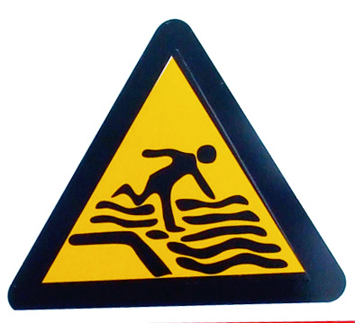
Explosive material: even more icons of doom


So I'm just posting these icons of doom, as usual, when Phil Gilbert sends me this one:

I wonder if the context helps? Barely...

Info design cartoons
It occurs to me that an incredible number of cartoons are information design jokes. Most of Roz Chast's output is like that (huge fan). And I had this nice Scott Garrett one from the Indie on Sunday on my notice board for years.


Wednesday, June 29, 2011
Unclear - just a typo away from oblivion
Discussing ways to simplify consumer contracts recently, the marketing director of a large firm remarked that his firm's contract contained various clauses that they never actually enforce because it would bad for their reputation. He thought they might as well just leave them out. When translated into plain English some contract terms might just seem too toxic to leave in.
It occurs to me that the process of simplification is also a kind of defusing or disarming. The Campaign for Unclear Disarmament, anyone? No, I thought not. That pun will go no further than this blog.
It occurs to me that the process of simplification is also a kind of defusing or disarming. The Campaign for Unclear Disarmament, anyone? No, I thought not. That pun will go no further than this blog.
Tuesday, June 21, 2011


Monday, May 02, 2011


Polite notite
People have written 'polite notice' on signs for many years, hoping we'll mistake it for 'police notice' and pay more attention. But the notices themselves are rarely convincing. Which is why this one, seen near Paddington Station, is quite impressive. Using the Transport font, in the right shade of blue, and built like the real thing, it's the best I've seen.


Sunday, April 24, 2011
Icon crazy
Andrew Belsey spotted this symbol. It was accompanied by some words, but have a go at interpreting it before clicking here for the answer.


Tuesday, April 19, 2011
You can't see them but they can see you
I always feel there must be a story behind every informal notice you see stuck up around a building.

Seen at the Royal College of Art.

Seen at the Royal College of Art.
Subscribe to:
Posts (Atom)